Our Colors & Fonts
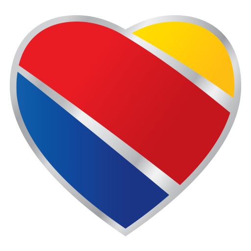
Our brand colors and typography reflect who we are: bold, approachable, and confident. Our primary colors—Bold Blue, Warm Red, Sunrise Yellow, Summit Silver, and Deep Silver—are a core part of our identity and help us stand out while representing the heart of Southwest.
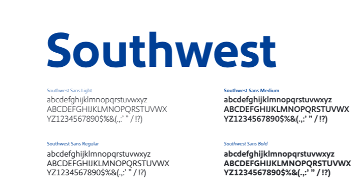
We use these colors sparingly to ensure maximum impact, complemented by a digital palette that keeps our communications consistent across all platforms. Our custom typeface, Southwest Sans, adds a modern and distinctive touch, giving our voice a unique personality.
When Southwest Sans isn't available, we rely on Arial as a trusted alternative for digital or dynamically generated content. Together, our colors and fonts help us create a cohesive and unmistakably Southwest experience.
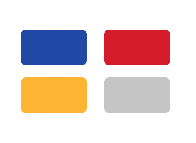
OUR PRIMARY COLORS
OUR PRIMARY COLORS—BOLD BLUE, WARM RED, SUNRISE YELLOW, AND SUMMIT SILVER ARE CENTRAL TO OUR BRAND IDENTITY, ALLOWING US TO CREATE A BOLD, COHESIVE, AND INSTANTLY RECOGNIZABLE VISUAL PRESENCE THAT REFLECTS THE HEART AND SPIRIT OF SOUTHWEST.
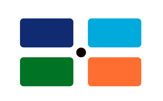
OUR SECONDARY COLORS
OUR SECONDARY COLORS—DARK BLUE, TURQUOISE, GREEN, ORANGE, AND BLACK—ENHANCE OUR BRAND IDENTITY BY PROVIDING FLEXIBILITY AND CONSISTENCY ACROSS DIGITAL AND PRINT COMMUNICATIONS.
OUR TYPOGRAPHY
OUR TYPOGRAPHY, SOUTHWEST SANS AND ARIAL, HELPS US CREATE A MODERN, DISTINCTIVE, AND ACCESSIBLE VOICE THAT REFLECTS THE HEART AND PERSONALITY OF SOUTHWEST.