Our Logo
Our logo represents who we are—bold, approachable, and centered around people—with the Heart symbolizing love, our commitment to caring for others, and our historic home at Dallas Love Field.
Our logo emphasizes the Southwest name with a custom-designed wordmark that is modern, simple, and clear.
The Heart Symbol punctuates the name, representing our distinctive People-Centered Culture. It remains true to our heritage and boldly expresses our Vision.
The logo is our singular expression, replacing both the Winged Heart and Takeoff logos in all channels.
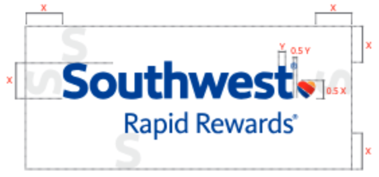
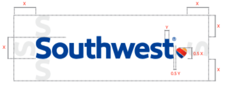
Logo Spacing
Always surround the Southwest logo with at least the required minimum of clear space, which is equal to the height of the capital “S” in Southwest. In digital, wayfinding, and signage applications only, the clear space may be reduced to one half of the capital “S” in Southwest. The logo must always be at least 1” wide.
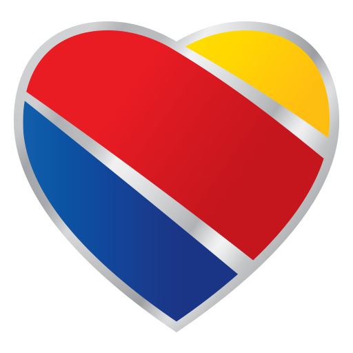
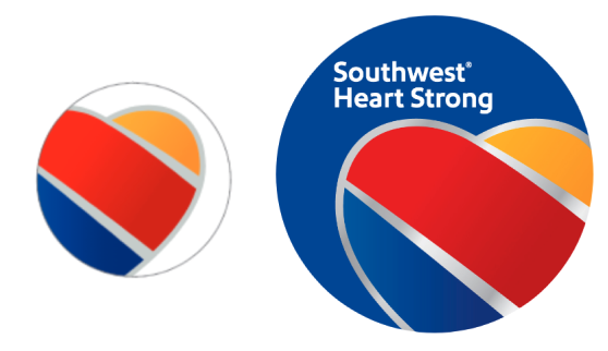
Heart Symbol
The heart symbol should always accompany our logo. It changes depending on the medium: the print heart uses a flat gray (left) and the online heart uses a silver gradient (right). Hearts may be cropped where appropriate.
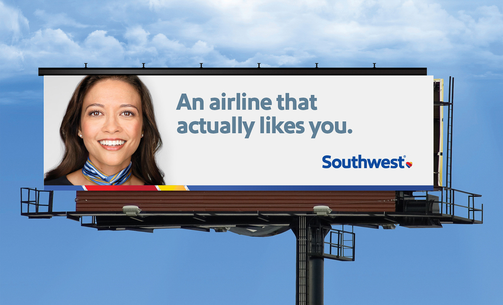
LOGO PLACEMENT
The placement of the logo for marketing materials (e.g., print advertising, OOH, magazine, packaging, etc.) is the top-right or bottom-right corner. When used in web applications and e-mail, the logo must be placed in the top-left corner. In mobile applications, the logo can be centered. There is more flexibility in placing the logo in social channels. However, centered placement is still reserved for the mobile application.
When posting to social channels, there is more flexibility in the position of the logo, but it cannot be centered. When placing the logo, consider the width of the channel space. For placements that look askew, centering can be used.
See logo placement examples below: